ShopDreamUp AI ArtDreamUp
Deviation Actions


Comments7
Join the community to add your comment. Already a deviant? Log In
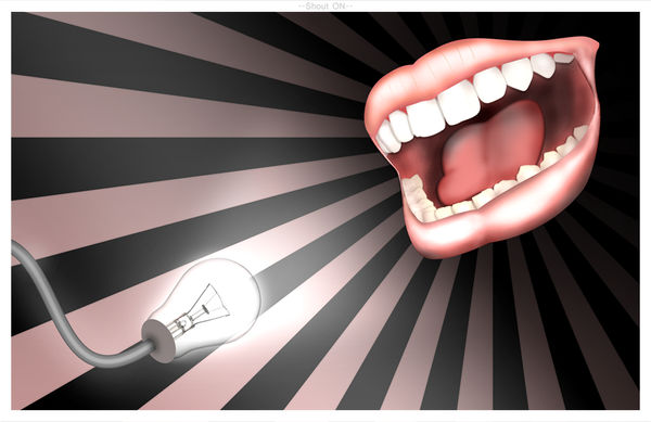
I see that reference material was used in the creation of this image, and there's no shame in that. Still, I think the end result of the "referencing" isn't as vibrant or captivating as it had the potential to be.
The mouth itself is lacking enough variation in shadows and highlights to feel tangible. It really feels quite cartoony. To some degree I could see where this would be desirable, but you're walking a line between cartoony and realism and the viewer is going to simply see the indecisiveness as a lack of skill (and I don't think skill is a problem with you). The light bulb also does not seem to be able to decide which way it wants to lean: cartoony or real.
The composition of this piece is also a bit confusing. I feel like there is a lot of emphasis in the top-right corner (the mouth) considering it's the largest object and it has the benefit of radiating lines coming out of it. As a result, the lightbulb gets an unfair shake. It's being treated like it's totally unimportant, but in actuality it's very important. Both the objects should be in closer proximity to one-another so as to not throw off the visual balance being created by the radiating lines.
Lastly, I have to ask: Is the mouth looking to eat the lightbulb?